I mentioned the ‘islands architecture’ in my first post about Astro. It may sound very fancy and all 🎩, but it’s actually rather simple! Let’s dive in :)
Static and dynamic content
In any website, we can have static and dynamic content on the page. Static content, as the name suggests, won’t change that much. It includes text, document structure, styles, and image URLs - generally contained in HTML and CSS files. Dynamic content, on the other hand, is stuff where you expect something to happen/change when you interact with it - think buttons, menus, widgets, popups, etc. Dynamic content will typically require JavaScript to work in the browser, and JavaScript requires time to load and setup on the page.
‘Islands’ allow us to isolate the dynamic parts of the website into their own little separate worlds. This way, we know exactly which parts of the website are static and which parts are dynamic, and the browser can then quickly load the essential, static content first.
Examples
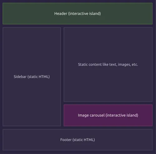
Here’s a diagram of what this might look like, pulled from Astro’s website:

In this example, the header and the image carousel are the dynamic parts of the website, and everything else is static. When a user navigates to this site, the browser will load the static content first. Browsers can download and render those static parts really quickly (it’s mostly text!), so this means that the user will (hopefully) be able to start reading the main text content right away. Meanwhile, in the background, the browser will load up the dynamic parts - the header and the image carousel - that will require more time to download and setup.
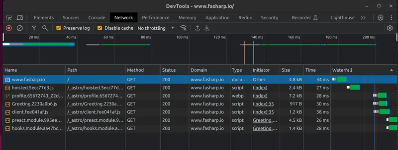
You can also see islands at work on this very website! I’ve set up a simple Greeting widget on my homepage that will select a random heading every time you click on it. This is a dynamic, interactive component that needs JavaScript to work (I’m using the Preact framework here). If you open up the DevTools Network tab and reload the page, you’ll see that the Greeting component and its Preact dependecies are only being loaded after the main content has come through. Notice the ‘Waterfall’ column on the right, showing the timeline of when things are loading:

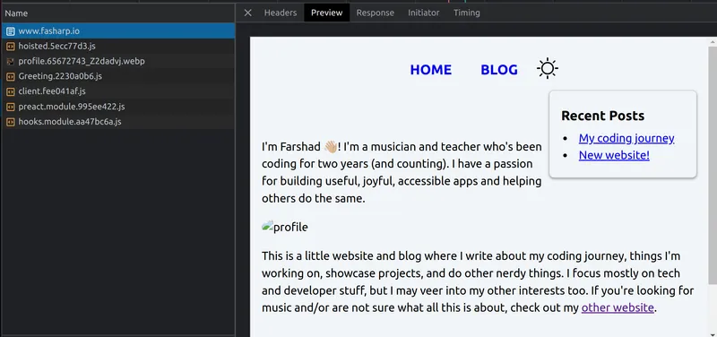
Now here’s the magical part - let’s open up just that first item, and see just how much of the website is actually coming through there:

Brilliant! All of the main text and styling is already there. So if the user has a slower internet connection, they’ll still be able to start reading and get a sense of what the site is about. In the meantime, the interactive Greeting component will load in the background (along with the profile image).
What’s the big deal?
So it looks like we’ve shaved off some initial loading time by using this pattern. But still, we’re talking about milliseconds here - is it really that important? Well, imagine that instead of that 5KB Greeting component, we had a 50KB interactive media player somewhere on the page. Or, a 500KB rich text editor. Well now, that’s gonna make a noticeable difference in loading time. Especially for folks who might not have access to high-speed internet.
In a lot of modern frameworks, these kinds of things are put in as an afterthought: “Oh, your site is loading slowly? Let’s put some lazy loading here and there, etc.” But frameworks built around islands, like Astro and Fresh, are built from the ground up to be this optimized, and that bodes well for performance.
Use cases
Alright, let’s dial down the hype and talk about when islands might not be the best architecture. We talked about how we’re prioritizing static content and isolating the dynamic content to get faster loading times. But what if our site is mostly interactive, dynamic content? I’m thinking a task manager with time tracking, a finance app with real-time tables and charts, or a music notation editor. In these cases, things will be constantly changing on the page, and it’s vital that components stay in sync with each other across the whole app. Islands are probably not the best approach here, and they’ll only get in the way of shipping a good product.
So what are the use cases? There are the obvious ones: blogs, marketing sites, and e-commerce. But there have been a plethora of tools to build those already… so let’s think a little outside the box here. How about an educational site with tons of little games and visual feedback built-in, and yet the site is still lightweight enough to be loaded by someone in a region with less-than-ideal internet speeds? How about a news website/blog where articles can come with highly interactive widgets and charts - but, since the static content is easily accessible, your AI assistant can still read it to you in the morning? How about a weather site that doesn’t take 2 years to load? (I’m looking at you, Accuweather!)
While these things have been possible to build for a while, frameworks built around ‘islands’ make it easier than ever to make a reality. Exciting stuff!
