“Icon buttons” are buttons that only appear as an icon with no visual, textual label. We often find them in places where space is limited - e.g. toolbars at the top of an app, or next to individual elements in a list of items. Think save buttons 💾, delete buttons , and like buttons ❤️. The sun/moon theme toggle button at the top of this website is a prime example.
The first rule of icon buttons is… don’t use icon buttons 😜. If at all possible. They can present an unnecessary learning curve for new users, and (depending on how they’re implemented) they could be downright disastrous for accessibility. That being said, sometimes we do need to use them, either because of space restrictions or something else. Let’s talk about how to make them friendly and accessible for our users!
Use the <button> element
With icon buttons, we’ll have an image that’s provided to us, perhaps from a library or our design team. It could be an SVG, a glyph from a custom font, etc.. Whatever it is, we’ll typically want to wrap this icon with something in our HTML, so that we can apply styles and re-use the icon button as a component throughout our app.
As the developer, we might be tempted to reach for a <div> or <span> element to wrap the icon, since these elements don’t have default styles and are “easier” to add custom styles to. But, if you read my last article on keyboard accessibility, you know how important it is to use the semantic HTML <button> on the web for our interactive, clickable elements. This is especially true for icon buttons!!
So, let’s not take the lazy route 😉. Let’s use the <button> element, and then clear out the browser’s default styles. Generally, this is all we need in our CSS to do that (but this can vary between browsers, so be sure to test this in all the browsers you want to support):
button.icon-button {  display: inline-flex;  cursor: pointer;
  background: none;  border: none;  padding: 0px;  margin: 0px;  font: inherit;}
This will clear out the default look of the <button> element, and add a helpful visual cue with the pointer cursor. And display: inline-flex makes it a bit easier to adjust the height and width of the button, and it also creates a flexbox within the button that can help with positioning things. Of course, you could always adjust these properties as needed, depending on how you want the icon button to look.
We could also use the newer all CSS property to clear out all the default <button> styles, but again, you’d want to make sure to test this thoroughly in different browsers:
button.icon-button {  all: unset;
  display: inline-flex;  cursor: pointer;}
By doing our due diligence and using the <button> element, we get several accessibility features out of the box. For example, screen readers will announce to the user that this is indeed a button that can be interacted with. The button also becomes focusable for keyboard users, and a visual outline is automatically added when the user is tabbing through elements and focuses on the icon button (see my previous article on how to customize the style of those outlines if needed).
Choose your icons wisely
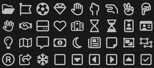
Take a look at these icons:
If these were buttons in an app that you were using for the first time, what would you think they do? Probably, something to do with adding and removing stuff, right? But… adding and removing what exactly?
Now look at these:
Even with no context, there’s something noticeably different about this second group of icons. We still seem to be able to add and remove things, but perhaps it’s related to dates or calendars somehow.
This seems like a small detail, but it could be the difference for your visual users who are just using the app for the first time! Try to be really conscientous about the icons you’re using, and where you’re using them.
Add labels
Since an icon button won’t have any clear, visual text label next to it, we need to make extra sure to add some other labels in our HTML, including (but not limited to) the title, aria-label, and aria-hidden attributes:
- The
titleattribute adds a visual tooltip to the button, which appears when the user hovers over the button with their cursor. - In the
aria-labelproperty, we’ll want to add a short description of what the button does. Screen readers will default to reading thearia-labelproperty when there is one. - We’ll want to add the
aria-hiddenattribute to the image itself. This way, screen readers will skip announcing an image and just announce the button itself, which is the important part.
<button class="icon-button" title="Save" aria-label="Save the current task"> <svg aria-hidden="true">...(your save icon SVG)...</svg></button>Notice we didn’t put the word “button” in our textual labels. Because we’re correctly using the <button> HTML element, a screen reader will already let the user know that this is a button, so there’s no need to duplicate that info in the label!
Conclusion
By choosing our icons wisely, using the correct HTML element, and using proper labels, we are well on our way to making our icon buttons helpful and accessible, and avoiding the common pitfalls associated with them. Again, ideally, we would never use icon buttons! But if we have to, these are some good general principles to keep in mind.